Topic Modeling
The topic labels on Atlas Data Maps describe the themes that points have in common across different regions of your data. These labels are generated when you upload data with topic modeling enabled (which is enabled by default).

Show Topic Labels
To show topics on your Atlas map, check the "Show Nomic Topic labels" switch in View Settings:

Reading Topics Like a Geographic Map
Like a map in a phone app or a classic tri-fold tucked in your glove compartment, Atlas serves as a guide through a landscape - with your data instead of geography.
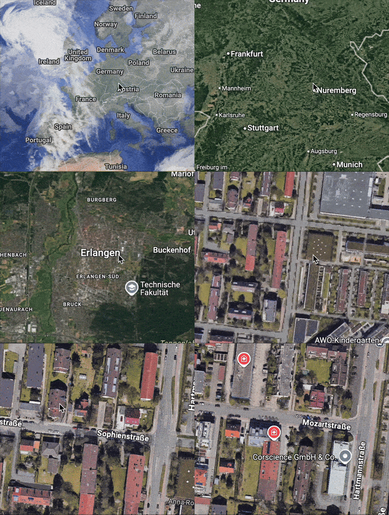
Zooming in through many levels of geographic detail
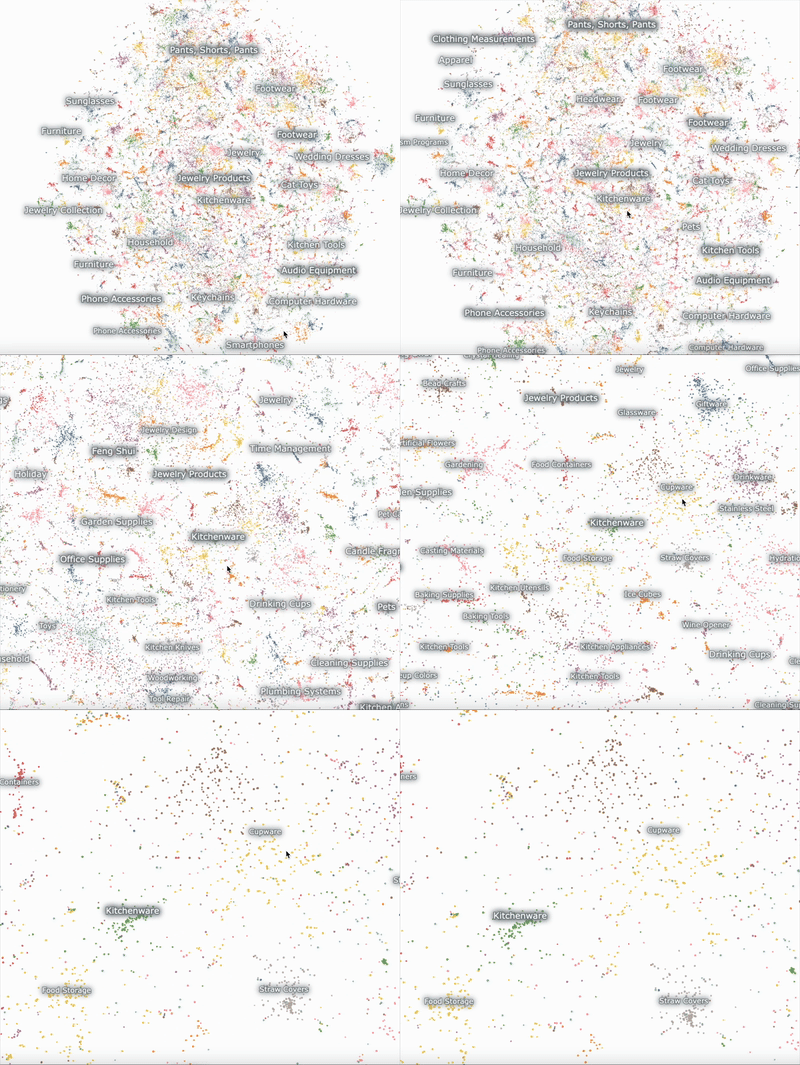
Zooming in through 3 levels of topic model granularity in an Atlas Data Map
Consider a digital map of Earth.
- When we see the whole world on our screen at once, we can see labels of continents, countries, ocean names and mountain ranges.
- Zooming in brings more granularity, like states and provinces, rivers, and lakes.
- Zooming in further, names of cities, towns and villages come into view.
- Zooming in even further, we may see labeled buildings, roads, paths, bridges, or monuments.
In Atlas, topics reveal themselves in a similar way as you zoom in on the map.
Topic Level Hierarchy
The topic model organizes your data into a hierachy allowing you to explore clusters in your data at different levels of resolution.
There are either 2 or 3 levels in a topic hierarchy, depending on the size of your dataset.
When you examine an individual data point in Atlas, its topics at each level of the hierarchy are visible in the left toolbar, ordered from most broad down to most specific.
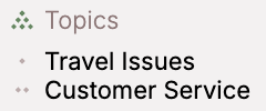
Example 2-level topics (broad and medium) for a point from a smaller dataset
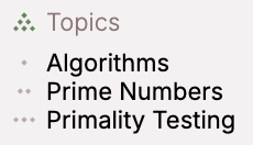
Example 3-level topics (broad, medium, and specific) for a point from a larger dataset
Color by Topic
The topic model can be used to recolor your data map at different levels of the topic model.
To change your map color to reflect the topic model, adjust the Color field in the View Settings to Nomic Topic: broad, medium, or specific.

This will color each point according to its topic at the level you've specified.

Broad topics

Medium topics

Specific topics
Filter by Topic
You can create a selection that filters for a particular topic three different ways:
Click Topic Label Directly
Click the topic label directly to activate or deactive a filter for that topic.
Click Topic in Legend
Click the topic name in the legend in View Settings to activate or deactive a filter for that topic.
Create Filter Selection for Topic
In the left toolbar, create a Filter selection, choose Nomic Topic: broad, medium, or specific, and then search for the topic you want to filter for.
Edit Topic Labels
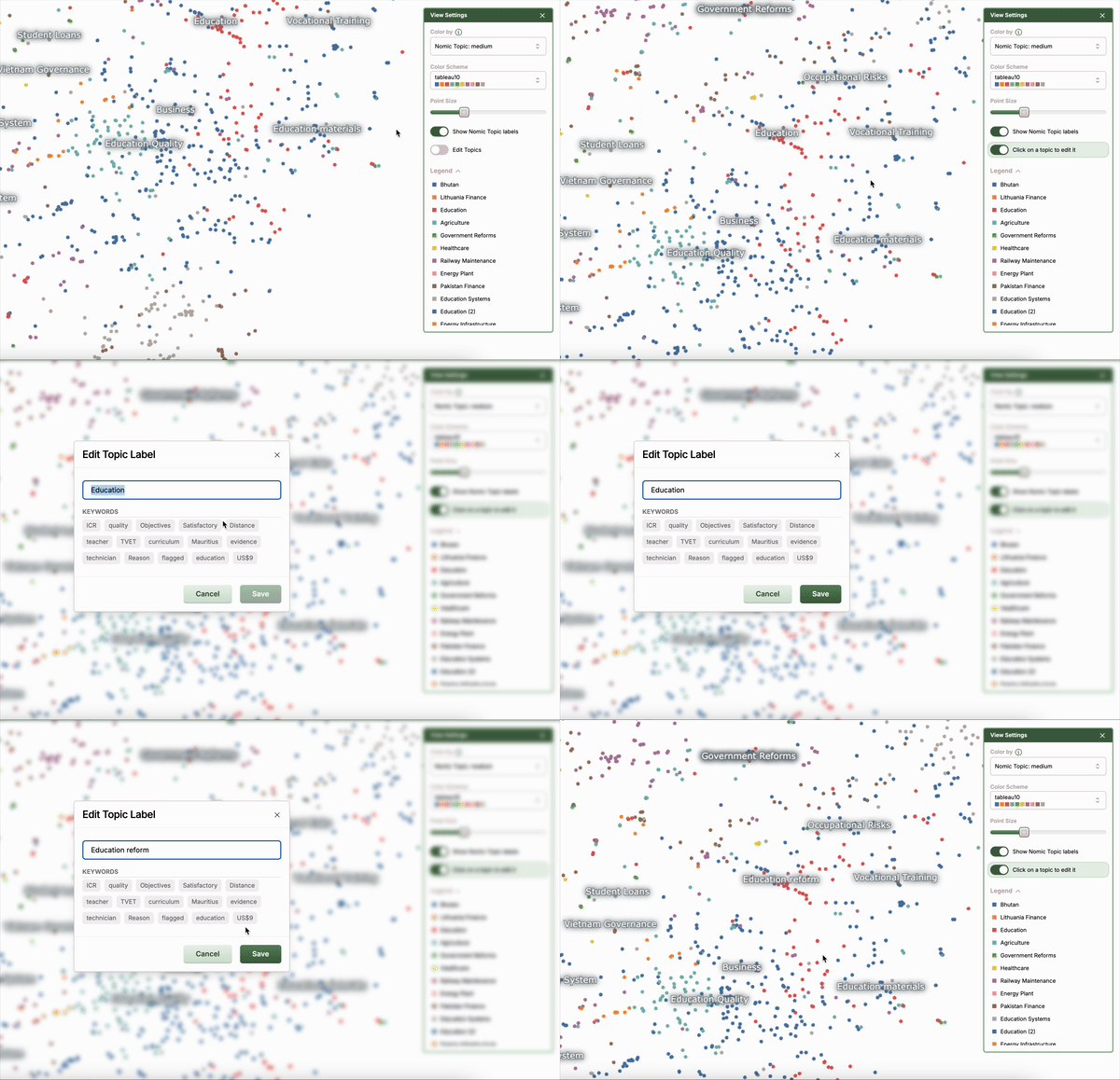
An editor of a dataset can update topic labels from within the Atlas Map. This is useful if you want to customize your topic labels for presentation purposes or rename the topic labels to suit your specific data.
In the View Settings panel, click the "Edit Topics" toggle to enter edit mode. In edit mode, click on a topic label to open a modal where the topic label can be altered. Within that modal the most prominent keywords related to that topic can also be viewed.
Once an edited topic label is saved, it is immediately reflected in the map, and propagated to the server. Other users of the map will see the updated topic upon refreshing the map.
Configure Topic Model
When creating your Atlas Dataset, you can configure whether to build a topic model, and which field from your data to use for generating topic labels. See our API Reference for more detail.
Access Topics Using the Python SDK
The topics which the Atlas system generates behind the scenes is directly accessible via Python. Information is available about topic hierarchy and topic density. Topic information can be used for downstream pipelines like visualization, analyses, and predictions.
Your embedding information can be accessed in the map.topics attribute of the AtlasDataset:
from nomic import AtlasDataset

map = AtlasDataset('my-dataset').maps[0]
# Pandas df of your data with columns ID, topic_depth_n, topic_depth_n+1, etc.
print(map.topics.df)
     id_    topic_depth_1          topic_depth_2             topic_depth_3
0    +Bw    Baby, Ray, Sunglasses  Apparel                   T-Shirts (2)
1    fHM    Phone Protector        Music Genre               Blues Music
2    9Ts    Lighting Replacement   Years                     Hyundai Engines
3    6mU    Women's Fashion (3)    Footwear (14)             Women's Sandals
4    8j8    Women's Fashion (3)    Tops, Shirts, Shirt       Women's Tops (2)
...  ...    ...                    ...                       ...
117238 GRs  Electronics (5)        Smartphones (3)           Computer Peripherals
117239 AULT Electronics (5)        Computer Hardware (2)     Computer Upgrades
117240 P0U  Electronics (5)        Computer Hardware (2)     Computer Hardware
117241 AWnV Electronics (5)        Computer Hardware (2)     Computer Hardware
117242 5Vg  Electronics (5)        Computer Hardware (2)     Computer Hardware

[117243 rows × 4 columns]
Topic Metadata
Pandas dataframe where each row corresponds to a unique topic. Metadata associated with each topic includes:
- topic depth
- a human-readable topic description (topic label)
- identifying keywords that differentiate the topic from other topics
# Returns a Pandas df
print(map.topics.metadata)
      depth  topic_id  topic_depth_1           topic_description                                 topic_short_description  topic_depth_2  topic_depth_3
0     1     0         Women's Fashion (3)      women/tops/dress/sandals/womens/casual/shoes/p...  Women's Fashion (3)     NaN           NaN
1     1     1         Electronics (5)          USB/Bluetooth/iPhone/charging/Intel/cable/HDMI...  Electronics (5)         NaN           NaN
2     1     2         Jewelry Collection (2)   jewelry/IceCarats/Jewelry/Type/ICECARATS/Sterl... Jewelry Collection (2)   NaN           NaN
3     1     3         Phone Protector         phone/Galaxy/Samsung/dogs/Watch/protector/scre...   Phone Protector         NaN           NaN
4     1     4         Pool Supplies           Pool/pool/Floats/chair/Brand/Amazon/Lathe/floa...   Pool Supplies           NaN           NaN
...   ...   ...       ...                     ...                                                 ...                      ...           ...
605   3     507       Lighting Replacement    hose/garden/Garden/watering/Hose/ft/plants/Jet...   Garden Hose             Plumbing S... Garden Hose
606   3     508       Lighting Replacement    Rate/9930/gallons/207/months/38℃/125PSI/GPM/34...   Water Pump              Plumbing S... Water Pump
607   3     509       Lighting Replacement    NPT/¼/½/PSI/Pump/Straight/tire/pump/12V/Connec...   Tire Pump               Plumbing S... Tire Pump
608   3     510       Lighting Replacement    drain/Drain/sink/pipe/Sink/stopper/steel/toile...   Plumbing Fixtures       Plumbing S... Plumbing Fixtures
609   3     511       Lighting Replacement    shower/water/Shower/filter/solar/fountain/head...    Bathroom Essentials     Plumbing S... Bathroom Essentials
610 rows × 7 columns
Topic Hierarchy
Learn more about your topic breakdown as a Python dictionary. What are the most general topics, and which sub-topics do they contain?
# map.topics.hierarchy is a dict

hierarchy = map.topics.hierarchy
print(f'Your depth 1 (most general) topics are: {hierarchy.keys()}')
Your depth 1 (most general) topics are: dict_keys([
  ("Women's Fashion (3)", 1),
  ('Electronics (5)', 1),
  ('Jewelry Collection (2)', 1),
  ...
])
You can use higher-level topic keys to access lower-level topics in your hierarchy.
import random
# List the subtopics in a random top-level topic
random_topic_1 = random.choice(list(hierarchy.keys()))
print(f'The general topic {random_topic_1} contains subtopics {hierarchy[random_topic_1]}')
The general topic ('Footwear (14)', 2) contains subtopics [
  'Shoes (3)', 'Sandal', 'Sneaker Culture', ..., "Women's Sandals"
]
Topic Groups
By providing a level of hierarchy, get a list of dictionaries where each item is a distinct topic at that level.
Keys for that topic include subtopics, subtopic_ids, topic_id, topic_short_description, topic_long_description, and datum_ids.
your_depth_level = 2
print(map.topics.group_by_topic(your_depth_level)[0])
{
  'subtopics': ['Miscellaneous (3)'],
  'subtopic_ids': [87],
  'topic_id': 16,
  'topic_short_description': 'Audio Equipment (3)',
  'topic_long_description': 'Bluetooth/speaker/Speaker/music/CarPlay/MP3/prevention/bluetooth/stereo/sound/karaoke/Loss/Radio/⭐/radio',
  'datum_ids': {'61c', '/WM', 'Rsw', 'q6I', ...,  'AVjU'}
}