Data Map Controls
The Atlas Data Map provides controls for exploring and analyzing your data.
Selections
The way you focus on subsets of data for analysis in Atlas is by creating selections. These are groups of points from your dataset that you can select using several different tools:
Vector Search
Search datasets based on similar vector embeddings.
Vector search has three modes:
Query Search (Default): Find data points that best answer a question you have about your data (e.g. "What's happening with the stock market?")
Document Search: Find data points that are most similar to a text sample you provide. (e.g. "Stock market performance")
Embedding Search: Find data points that are close to a user-inputted embedding (e.g. [0.42, 0.87, 0.013, ...]). This is the only mode supported for Embedding datasets. The search will fail or provide incorrect results if your embedding does not have the same dimensionality as your dataset's embeddings or comes from a different embedding model/space.
Exact Search

Search datasets based on exact keyword or regular expression matches.
Search any column in your dataset to highlight exact-matching points on your Atlas Map.
For complex searches, use the helper tools below to match complete words or exact case. Regular expressions enable advanced pattern matching.
Search options
Only match complete words

Match case exactly

Regular expression search
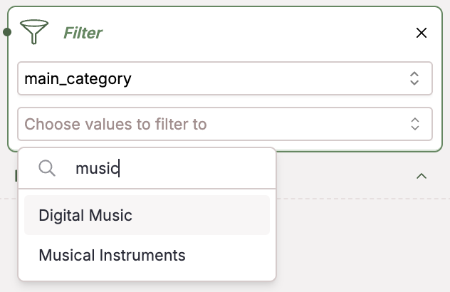
Filter

Apply filters to your data to filter over metadata, giving you new views and greater insight into your dataset. Filter over any of your numerical metadata values like sentiment value, temperature, price, score, and much more.
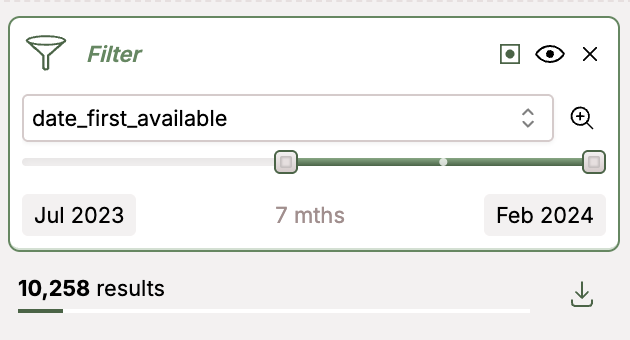
Slicing by timestamp allows you to see change in topics over time:
Lasso
Drag a lasso around a region of space to select all points contained in your region
The Lasso tool allows you to select points on the map by circling them with your mouse. Lassoing can be a part of your data pipeline as you find, select, tag, and clean your data.
Cherry Pick
Click individual points to add them to a selection.
With the cherrypick tool activated, each point you individually click on will be added to your selection.
Adding Tags to a Selection
Tags can be applied to selections created using any of the methods above (Search, Filter, Lasso, Cherry Pick). Tagging is useful for organizing data, marking specific subsets for further analysis, or tracking data cleaning progress.
- Create Selection: Use any of the selection tools (Vector Search, Exact Search, Filter, Lasso, Cherry Pick) to select the data points you want to tag.
- Open Tagging Panel: In the selection results panel on the left (where it shows the number of results), click the Tag all results button.
- Enter Tag Name: In the pop-up window that appears, type the name for your new tag
- Add Tag: Click the Add button to add your tag to the selected points
- Use Tag: After tagging, you can use the Filter tool to select points based on the tags you've added, allowing you to easily revisit or analyze specific subsets of your data
View Settings
Color
You may color by existing columns in your data. Coloring works for both categorical or numerical data types.

To color datapoints by topic clusters, you can color by Nomic Topic: 1/2/3. Depth level 1 is most general and depth level 3 is the most specific. This can give you a clearer view of the divisions and overlap between different topics in your data.
The legend on your graph will describe the current labels corresponding to colors of points on the map. If the colorable field is one of the Nomic Topic depth levels, then the labels in the legend and on the map will be the topic labels themselves.
Point Size
Adjust your point size to any size that works for you — the right point size can better highlight the structures in the map, help you more quickly identify outliers, or more easily identify color patterns.
To adjust the size of the data points displayed in your map, adjust the slider bar under Point Size:

Topic Labels
Show Topic Labels
To show topics on your Atlas map, check the "Show Nomic Topic labels" switch in View Settings:

Edit Topic Labels
An editor of a dataset can update topic labels from within the Atlas Map.
In the View Settings panel, click the "Edit Topics" toggle to enter edit mode. In edit mode, click on a topic label to open a modal where the topic label can be altered. Within that modal the most prominent keywords related to that topic can also be viewed.
Once an edited topic label is saved, it is immediately reflected in the map, and propagated to the server. Other users of the map will see the updated topic upon refreshing the map.
Position Mode
Try combining XY positioning modes with selection filters for more precise data exploration. For example, make a selection in one mode then switch to another to see those points in a different context.
Atlas provides multiple ways to position points on your map:
Points are positioned using projection algorithms that create a 2D representation of your high-dimensional data:
- UMAP: Default for datasets with fewer than 50,000 points
- Nomic Project: Default for datasets with 50,000 or more points
You can also position points using custom X/Y coordinates or geospatial (latitude/longitude) coordinates if your dataset includes appropriately named columns. See Prepare Data for Atlas for details on how to format your data.
To switch between available positioning modes, use the 'Position Mode' dropdown in the View Settings panel.